
Caslon Antique for the Board?
-
eastmidswhizzkid

- Faster Than The Light Of Speed
- Posts: 9689
- Joined: 24 Mar 2005, 00:01
- Location: WhizzWorld
- Contact:
self explanatory i guess but would it be possible to have an option of the caslon antique font for signatures etc?

Well I was handsome and I was strong
And I knew the words to every song.
"Did my singing please you?"
"No! The words you sang were wrong!"

And I knew the words to every song.
"Did my singing please you?"
"No! The words you sang were wrong!"
-
Quiff Boy

- Herr Administrator
- Posts: 16757
- Joined: 25 Jan 2002, 00:00
- Location: Lurking and fixing
- Contact:
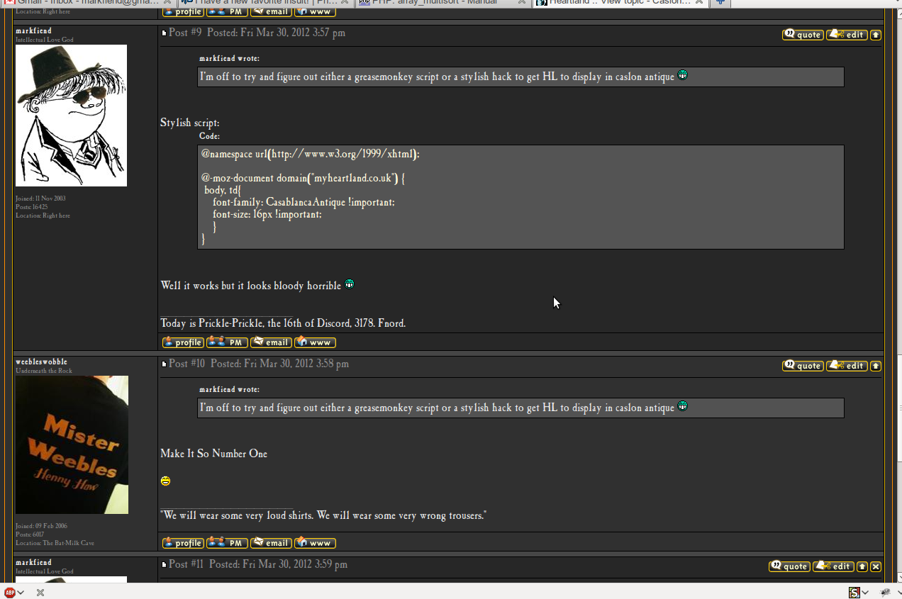
I've tried something like that in forum themes before but the main issue is that caslon antique (or at least the web font version of it) is illegible at small sizes - it's so think and ornate that small characters (eg 10pt) just looks like a dark blob. you can't make out individual letters.
for example, in the site name and description in the header:
that's fine when it's uppercase - caslon antique works better in uppercase - but when it's in lowercase you quickly start to see how tricky it gets. much smaller and it's illegible
for eg:

it really works best as a poster font, for headings and titles, at larger font sizes
when it's applied to entire sentences or paragrahs of text, or god forbid whole web pages, it's basically unreadable (i'm sure folks have seen goth fan sites and homepages that use caslon antique for everything, and you can't read it)
for example, in the site name and description in the header:
"THE SISTERS OF MERCY FORUM" bit is 18pt. HEARTLAND .
THE SISTERS OF MERCY FORUM
that's fine when it's uppercase - caslon antique works better in uppercase - but when it's in lowercase you quickly start to see how tricky it gets. much smaller and it's illegible
for eg:
it really works best as a poster font, for headings and titles, at larger font sizes
when it's applied to entire sentences or paragrahs of text, or god forbid whole web pages, it's basically unreadable (i'm sure folks have seen goth fan sites and homepages that use caslon antique for everything, and you can't read it)
What’s the difference between a buffalo and a bison?
-
markfiend

- goriller of form 3b
- Posts: 21181
- Joined: 11 Nov 2003, 10:55
- Location: st custards
- Contact:
Yeah I did some fancy-schmancy thing a few years back to try to get Caslon on HL and unfortunately as an online typeface it's virtually illegible.
The fundamental cause of the trouble is that in the modern world the stupid are cocksure while the intelligent are full of doubt.
—Bertrand Russell
—Bertrand Russell
-
DJElectricDaddy

- Gonzoid Amphetamine Filth
- Posts: 307
- Joined: 29 Aug 2020, 19:56
- Location: Where the sun shines bright. Where the rain don’t fall
- Contact:
Yeah serif fonts were designed to work in print, while due to the nature of screen pixels, sans serifs will be better suited for web based/digital typography. Especially as you point out, at smaller sizes. Even with yer fancy dandy Retina display
Somewhere on a tiny planet
crawl some ants called the human race
Lost in time
Lost in space
And meaning
crawl some ants called the human race
Lost in time
Lost in space
And meaning
It's straightforward enough on Wordpress so I tried it on the Abridged website but agree completely, doesn't work at all. Sadly!
The Chancer Corporation
-
eastmidswhizzkid
- Faster Than The Light Of Speed
- Posts: 9689
- Joined: 24 Mar 2005, 00:01
- Location: WhizzWorld
- Contact:
My apologies for failing to see these replies at all -it wasn't deliberate ignorance i assure you. thanks for your efforts and explanations. 
Well I was handsome and I was strong
And I knew the words to every song.
"Did my singing please you?"
"No! The words you sang were wrong!"
And I knew the words to every song.
"Did my singing please you?"
"No! The words you sang were wrong!"