
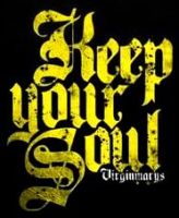
just wondering if anyone knows a source or have a proper, sharp scan of front/back design of the new 2005 tour shirt?
thanks a lot!!
sister 2005
tour shirt design?
There is pictures of it in this thread. http://www.myheartland.co.uk/viewtopic.php?t=8178
If you think too long about your next step you will spend your life on one leg.
just found this pics via http://www.poison-door.net/sisters2005 wrote:just wondering if anyone knows a source or have a proper, sharp scan of front/back design of the new 2005 tour shirt?
thanks a lot!!
sister 2005


-
sisters2005
- Road Kill
- Posts: 2
- Joined: 16 Aug 2005, 08:44
anyone with better sharper pic/photo without the shirt ripples...meaning nice flat.....?
-
nick the stripper
- Slight Overbomber
- Posts: 1732
- Joined: 16 Dec 2004, 01:02
- Location: Somewhere between Athens and Jerusalem.
- Contact:
Did they get the idea to call the T-shirts "Sisters Europe" from the Psychedelic Furs song "Sister Europe?"
-
timsinister

- The Oncoming Storm
- Posts: 4548
- Joined: 04 Jan 2005, 17:08
- Location: Newcastle
- Contact:
Controversy!nick the stripper wrote:Did they get the idea to call the T-shirts "Sisters Europe" from the Psychedelic Furs song "Sister Europe?"
You must have something particular in mind...sisters2005 wrote:anyone with better sharper pic/photo without the shirt ripples...meaning nice flat.....?
[/snip pics]
Less is more
-
Planet Dave
- Underneath the Rock
- Posts: 6569
- Joined: 22 Apr 2003, 23:51
- Location: Where the streets fold round
Does anyone have any idea what font type is used on the new shirt? A derivative of Caslon Antique I assume, but with funky M's and W's and R's.
Any ideas?
Any ideas?
There is increasing evidence to suggest that Chris may have been being sarcastic.
-
markfiend

- goriller of form 3b
- Posts: 21181
- Joined: 11 Nov 2003, 10:55
- Location: st custards
- Contact:
The R is just an upside-down L by the looks of it (reflected rather than rotated) The M and the W are each other rotated (if you see what I mean) And in the dates they've used O (capital letter) rather than 0 (numeral)
It's probably something custom-built off a Caslon Antique base.
It's probably something custom-built off a Caslon Antique base.
The fundamental cause of the trouble is that in the modern world the stupid are cocksure while the intelligent are full of doubt.
—Bertrand Russell
—Bertrand Russell
The "upside-down L" looks almost identical to the "R[/G]" on the Roadkill/Goldkill logo. The "A" however, is intact, which is confusing.

-
AndreMcCabe

- Road Kill
- Posts: 94
- Joined: 11 Aug 2005, 12:57
- Location: Banned for poor trading/weeding behaviour
any conclusions?
...meanwhile back in space
-
lazarus corporation
- Lord Protector
- Posts: 3425
- Joined: 09 May 2004, 17:42
- Location: out there on a darkened road
- Contact:
erm, they were running low on the letraset Ms, Ws, Rs and 0s?AndreMcCabe wrote:any conclusions?
-
Planet Dave
- Underneath the Rock
- Posts: 6569
- Joined: 22 Apr 2003, 23:51
- Location: Where the streets fold round
Cheers boys. 

<blimey, these anoraks get warm, don't they>
<blimey, these anoraks get warm, don't they>
There is increasing evidence to suggest that Chris may have been being sarcastic.
-
markfiend
- goriller of form 3b
- Posts: 21181
- Joined: 11 Nov 2003, 10:55
- Location: st custards
- Contact:
Just a thought...
You wouldn't be planning to bootleg the shirt would you?sisters2005 wrote:anyone with better sharper pic/photo without the shirt ripples...meaning nice flat.....?
I think you're rightPetseri wrote:The M looks like a Cyrillic T to me.markfiend wrote:The M and the W are each other rotated (if you see what I mean)
Martin
The fundamental cause of the trouble is that in the modern world the stupid are cocksure while the intelligent are full of doubt.
—Bertrand Russell
—Bertrand Russell
-
James Blast
- Banned
- Posts: 24699
- Joined: 11 Jun 2003, 18:58
- Location: back from some place else
of that design?!markfiend wrote:You wouldn't be planning to bootleg the shirt would you?
I don't mind the typo, it's the head cog and colour scheme I'm not too keen on
"And when you start to think about death, you start to think about what's after it. And then you start hoping there is a God. For me, it's a frightening thought to go nowhere".
~ Peter Steele
~ Peter Steele

And the "r" looks like a cyrillic "G" to me...Petseri wrote:The M looks like a Cyrillic T to me.markfiend wrote:The M and the W are each other rotated (if you see what I mean)
Martin
... keep laughing ... kindredspirits.tk - debut album out now!
-
markfiend
- goriller of form 3b
- Posts: 21181
- Joined: 11 Nov 2003, 10:55
- Location: st custards
- Contact:
Indeed. Like Motz mentioned about the Roadkill/Goldkill thing.
@Blast: Typo?
@Blast: Typo?
The fundamental cause of the trouble is that in the modern world the stupid are cocksure while the intelligent are full of doubt.
—Bertrand Russell
—Bertrand Russell
-
James Blast
- Banned
- Posts: 24699
- Joined: 11 Jun 2003, 18:58
- Location: back from some place else
I left out the graphy 
"And when you start to think about death, you start to think about what's after it. And then you start hoping there is a God. For me, it's a frightening thought to go nowhere".
~ Peter Steele
~ Peter Steele
-
markfiend
- goriller of form 3b
- Posts: 21181
- Joined: 11 Nov 2003, 10:55
- Location: st custards
- Contact:
Ohhhhhh! I see.
I'm sure you know what I thought you meant
Me -->
I'm sure you know what I thought you meant
Me -->
The fundamental cause of the trouble is that in the modern world the stupid are cocksure while the intelligent are full of doubt.
—Bertrand Russell
—Bertrand Russell