
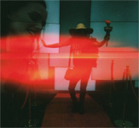
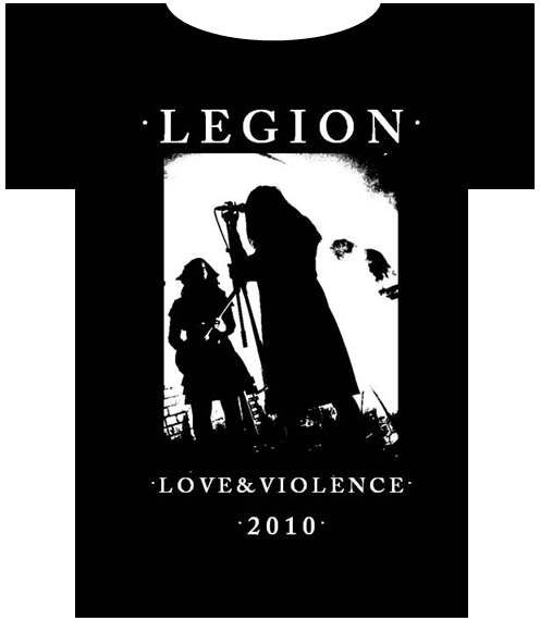
At the moment I use the standard Caslon Antique, which is quite a chunky font (looks like this: www.legion-music.co.uk).
Can anyone recommend any decent variations on this. Specifically I'm looking for both a more slender version of the Antique font and an non antique style one (as seen on very early Sisters records, such as here).
Download links would also be very welcome!
Variations on the Caslon Font
-
NickW
- Amphetamine Filth
- Posts: 139
- Joined: 29 Jun 2009, 20:56
- Location: Closer to where I want to be than I was
Maisey
Aren't you dead ?
At the moment I use the standard Caslon Antique, which is quite a chunky font (looks like this: www.legion-music.co.uk).
Can anyone recommend any decent variations on this. Specifically I'm looking for both a more slender version of the Antique font and an non antique style one (as seen on very early Sisters records, such as here).
Download links would also be very welcome!
_________________
Fire Over Water - Heart Over Soul
LEGION: WEBSITE - MYSPACE
Under The Rose
Just one of the pesky kids
-
Holly_DelRey

- Utterly Bastard Groovy Amphetamine Filth
- Posts: 892
- Joined: 27 Feb 2010, 21:48
- Contact:
Exactly what I was thinkingMaisey wrote:What??!


-
markfiend

- goriller of form 3b
- Posts: 21181
- Joined: 11 Nov 2003, 10:55
- Location: st custards
- Contact:
IIRC the one on the Body Electric 7" is standard Caslon Antique. 
I know it doesn't look like it on that cover photie you posted but I'm pretty sure.
I know it doesn't look like it on that cover photie you posted but I'm pretty sure.
The fundamental cause of the trouble is that in the modern world the stupid are cocksure while the intelligent are full of doubt.
—Bertrand Russell
—Bertrand Russell
-
moses

- Utterly Bastard Groovy Amphetamine Filth
- Posts: 564
- Joined: 03 Sep 2008, 12:38
- Location: On The Darkside Of The Tune
Why not be a little bit creative or even imaginative and stop tomb-raidingMaisey wrote:At the moment I use the standard Caslon Antique, which is quite a chunky font (looks like this: www.legion-music.co.uk).
Can anyone recommend any decent variations on this. Specifically I'm looking for both a more slender version of the Antique font and an non antique style one (as seen on very early Sisters records, such as here).
Download links would also be very welcome!
The ceremony of innocence is drowned;
The best lack all conviction, while the worst
Are full of passionate intensity
The best lack all conviction, while the worst
Are full of passionate intensity
-
vicus

- Utterly Bastard Groovy Amphetamine Filth
- Posts: 997
- Joined: 21 Apr 2002, 01:00
- Location: behind the door
- Contact:
"Am Anfang wurde das Universum erschaffen.
Das machte viele Leute sehr wütend und wurde allenthalben als Schritt in die falsche Richtung angesehen."
http://www.poison-door.net/
Das machte viele Leute sehr wütend und wurde allenthalben als Schritt in die falsche Richtung angesehen."
http://www.poison-door.net/
-
James Blast

- Banned
- Posts: 24699
- Joined: 11 Jun 2003, 18:58
- Location: back from some place else
this is truemarkfiend wrote:IIRC the one on the Body Electric 7" is standard Caslon Antique.
I know it doesn't look like it on that cover photie you posted but I'm pretty sure.
"And when you start to think about death, you start to think about what's after it. And then you start hoping there is a God. For me, it's a frightening thought to go nowhere".
~ Peter Steele
~ Peter Steele
-
weebleswobble

- Underneath the Rock
- Posts: 5875
- Joined: 09 Feb 2006, 06:57
- Location: The Bat-Milk Cave
- Contact:
but it's crumbly goth font innit?moses wrote:Why not be a little bit creative or even imaginative and stop tomb-raidingMaisey wrote:At the moment I use the standard Caslon Antique, which is quite a chunky font (looks like this: www.legion-music.co.uk).
Can anyone recommend any decent variations on this. Specifically I'm looking for both a more slender version of the Antique font and an non antique style one (as seen on very early Sisters records, such as here).
Download links would also be very welcome!
‎"We will wear some very loud shirts. We will wear some very wrong trousers."
-
sultan2075

- Overbomber
- Posts: 2379
- Joined: 04 Mar 2005, 19:17
- Location: Washington, D. C.
- Contact:
It should be replaced with drippy Slayer album-cover writing.
Or maybe the Iron Maiden font.
Or maybe the Iron Maiden font.
--
The most successful tyranny is not the one that uses force to assure uniformity but the one that removes the awareness of other possibilities, that makes it seem inconceivable that other ways are viable, that removes the sense that there is an outside.
The most successful tyranny is not the one that uses force to assure uniformity but the one that removes the awareness of other possibilities, that makes it seem inconceivable that other ways are viable, that removes the sense that there is an outside.
-
Maisey
- Slight Overbomber
- Posts: 1870
- Joined: 28 Jun 2006, 20:19
- Location: Moving like a Parallelogram
That's the same as the one I'm already using.vicus wrote:http://www.sepultura.de/dl/casa.zip
What about the non-crumbly version?
Nationalise the f**king lot.
-
Maisey
- Slight Overbomber
- Posts: 1870
- Joined: 28 Jun 2006, 20:19
- Location: Moving like a Parallelogram
Right, I've got my copy of Body Electric out and I can confirm that while it is Antique, it is MUCH more even than the version of Caslon Antique that I've seen floating around the internet (and on later sisters releases for that matter).
The font on BE is mildly eroded, but the original letter shape is still fully preserved.
The font on BE is mildly eroded, but the original letter shape is still fully preserved.
Nationalise the f**king lot.
-
Maisey
- Slight Overbomber
- Posts: 1870
- Joined: 28 Jun 2006, 20:19
- Location: Moving like a Parallelogram
1. Because I like Caslon Antique.moses wrote:
Why not be a little bit creative or even imaginative and stop tomb-raiding
2. Because I like not just the Sisters, but I quite enjoy a lot of the followers who also did also. Caslon Antique is a statement.
3. Because music isn't all about pushing boundaries. Sure - it's important that some bands do, but I see nothing wrong with rehashing an old idea if you can do it well. Lot's of bands I really enjoy are just a well executed collage of their influences. That's not to say bands can't be rubbish because they're derivative, I'm just saying that it doesn't necessarily follow.
4.
weebles wrote:it's crumbly goth font innit?
Nationalise the f**king lot.
-
James Blast
- Banned
- Posts: 24699
- Joined: 11 Jun 2003, 18:58
- Location: back from some place else
let me give you an history lesson little boy:
back in the mist of the 80s computers were rarely if ever used in graphic design, it was only in its infancy. back then you had 'real' graphic designers who would sketch out ideas with pen and paper. they would then painstakingly Letrasetâ„¢ out their headline type THE SISTERS OF MERCY it would rarely (if ever) be the correct size you needed for final artwork so you would reduce or enlarge it in a darkroom with a piece of equipment called a 'copy camera'. a number of variables come into play here: exposure time, state of chemicals and just how flat the base board was. sometimes all three of them would be off and you would end up with something totally unusable, most times you got something usuable and since you were a struggling agency or repro house, you go with it. the paper used in these cameras only saw black and white, no colour, no greys - lith. so it was easy to over expose type with a fuzzy edge or shoot it slightly out of focus and have it burn away any fidelity.
that's what's happened on Body Electric
nes pas?
tootle along now
"And when you start to think about death, you start to think about what's after it. And then you start hoping there is a God. For me, it's a frightening thought to go nowhere".
~ Peter Steele
~ Peter Steele
-
markfiend
- goriller of form 3b
- Posts: 21181
- Joined: 11 Nov 2003, 10:55
- Location: st custards
- Contact:
It wouldn't surprise me if the "graphic design" on a lot of the early Sisters singles was done on a photocopier TBH.
The fundamental cause of the trouble is that in the modern world the stupid are cocksure while the intelligent are full of doubt.
—Bertrand Russell
—Bertrand Russell
-
James Blast
- Banned
- Posts: 24699
- Joined: 11 Jun 2003, 18:58
- Location: back from some place else
the image of the Bacon painting would certainly confirm that
"And when you start to think about death, you start to think about what's after it. And then you start hoping there is a God. For me, it's a frightening thought to go nowhere".
~ Peter Steele
~ Peter Steele

-
NickW
- Amphetamine Filth
- Posts: 139
- Joined: 29 Jun 2009, 20:56
- Location: Closer to where I want to be than I was
Sorry my last post on here made no sense- due to a combination of drunkeness and ludditism (both on my part) . 
the comment was in part a flippant reference to How Maisey and Myself had filled the void of Sunday afternoon. (extras in a mutual friends video) It was also trying to point out that the use of said font was a bit old hat ( a point the poster moses made far more eruditely(?)) this all seemed to make perfect sense in my drunken befuddlement
there was then meant to be a further comment that although old hat use of such font normally gave you a very good indication of said bands style and had attracted me to go see Legion in the first place ( ludditism had taken over at this point and this later comment had been typed on a non responding keyboard and a very confusing missive was on its way to the forum )
-
Silver_Owl

- The Don
- Posts: 7498
- Joined: 27 Sep 2003, 18:52
Not so funny when you have to explain it is it? 
We forgive as we forget
As the day is long.
As the day is long.
-
moses
- Utterly Bastard Groovy Amphetamine Filth
- Posts: 564
- Joined: 03 Sep 2008, 12:38
- Location: On The Darkside Of The Tune
That's supposed to be a rasher of bacon??James Blast wrote:the image of the Bacon painting would certainly confirm that
The eggs were obviously dropped in the making of the record
The ceremony of innocence is drowned;
The best lack all conviction, while the worst
Are full of passionate intensity
The best lack all conviction, while the worst
Are full of passionate intensity
-
Maisey
- Slight Overbomber
- Posts: 1870
- Joined: 28 Jun 2006, 20:19
- Location: Moving like a Parallelogram
Oh it's YOU!NickW wrote:Sorry my last post on here made no sense- due to a combination of drunkeness and ludditism (both on my part) .
the comment was in part a flippant reference to How Maisey and Myself had filled the void of Sunday afternoon. (extras in a mutual friends video) It was also trying to point out that the use of said font was a bit old hat ( a point the poster moses made far more eruditely(?)) this all seemed to make perfect sense in my drunken befuddlement
there was then meant to be a further comment that although old hat use of such font normally gave you a very good indication of said bands style and had attracted me to go see Legion in the first place ( ludditism had taken over at this point and this later comment had been typed on a non responding keyboard and a very confusing missive was on its way to the forum )
Jesus Nick, way to sound weird as hell.
I agree, using white on black Caslon Antique is, more often than not, an assurance that you'll be seeing guitars, drum machines and too much black. No assurance as to the quality of that package through, but it does imply a certain product.
As it happens I'm currently doing some T Shirt designs in he font "Caslon Pro" which doesn't have the crumbly edges.
Bloody hell, this is almost avant-garde.
Nationalise the f**king lot.
-
NickW
- Amphetamine Filth
- Posts: 139
- Joined: 29 Jun 2009, 20:56
- Location: Closer to where I want to be than I was
Oh it's YOU!
Jesus Nick, way to sound weird as hell.
I agree, using white on black Caslon Antique is, more often than not, an assurance that you'll be seeing guitars, drum machines and too much black. No assurance as to the quality of that package through, but it does imply a certain product.
As it happens I'm currently doing some T Shirt designs in he font "Caslon Pro" which doesn't have the crumbly edges.
Bloody hell, this is almost avant-garde.
Weird as hell me, what else would you expect.
And if I see white on black Caslon Antique font i expect to hear guitars and drum machines not necessarily see them
And this is the first time I have ever been associated with avant garde
-
Maisey
- Slight Overbomber
- Posts: 1870
- Joined: 28 Jun 2006, 20:19
- Location: Moving like a Parallelogram
I meant my use of a non crumbly version of the Caslon font was bordering on avant garde. Which is, obviously not true.
By the way, if you press the quote button at the top right hand corner of the message you want to quote it puts it in a box...
By the way, if you press the quote button at the top right hand corner of the message you want to quote it puts it in a box...
and makes it easier to read.Maisey wrote:...like this
Nationalise the f**king lot.