Page 3 of 4
Posted: 11 Apr 2006, 09:01
by doctoravalanche
No i haven't done the tee myself, I went to a shop with the font and the logo, and they did a great job, I can ask them if you want which software they use, as I know the owner of the shop ...
Posted: 16 Apr 2006, 09:03
by christophe
The New one isn't that bad but I prefere the Old one,
and I like the first MR logo, the 2 circle thingy....
Posted: 16 Apr 2006, 10:54
by Syberberg
Well, I've got both painted on the back of my leather...
I don't like the circle around the "new" logo, remove that (which I did for my leather) and I'd be completely 50/50. That reminds me, they need touching up before the gigs in Leeds/Manchester.
The logo from the Black October Tour/Walk Away/F&L&A cover is nice too, but nowehere near as striking.
BTW, did you know that, when peeling the skin from a human skull, it makes exactly the same noise as peeling an orange? Strange but true.
Posted: 16 Apr 2006, 11:08
by Obviousman
Got any experience peeling that of then?

Posted: 16 Apr 2006, 11:12
by Silver_Owl
Posted: 16 Apr 2006, 11:24
by Syberberg
Obviousman wrote:Got any experience peeling that of then?
Yeah, I had a student nurse friend who lived in the same house as me many years ago. He snuck me into an autopsy observation pretending I was a first year student. I did throw up, but only once the mortician opened the body cavity. At least I won the bet that I wouldn't faint.
Posted: 16 Apr 2006, 11:54
by Obviousman
Posted: 16 Apr 2006, 11:56
by Silver_Owl
Put me right off my chow mein that has.
Posted: 16 Apr 2006, 13:19
by Badlander
Syberberg wrote:
BTW, did you know that, when peeling the skin from a human skull, it makes exactly the same noise as peeling an orange? Strange but true.
Gross.

Glad I already had lunch.
Posted: 16 Apr 2006, 19:05
by James Blast
I had a spot on the lefthand side of my face removed under local anaesthetic and I definitley heard the sound of an orange being peeled during the op
Posted: 16 Apr 2006, 19:44
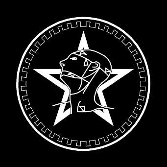
by boudicca
Old one, by far. Macabre, more obviously an anatomical drawing (something I have a soft spot for).
The new one seems to
endorse baldness, as well it might given Von's current state of follicular frugality. Tsk tsk.
However, I do like the "cog" (as has been appropriated by HL for the upper right-hand corner of the page, if you've got the normal layout anyway). It would be groovy if you could have the old logo, surrounded by the new cog.

Posted: 16 Apr 2006, 20:48
by James Blast
like this?

Posted: 16 Apr 2006, 22:45
by Arrrgh!
Aargh! I really want that logo on a spanky new shirt - Quiffy - fancy a second version of the new Myheartland.co.uk shirt - this logo on the front and the url on the back? I'd buy one, and I'd pay more than a dollar!
Posted: 16 Apr 2006, 22:52
by scotty
James Blast wrote:like this?
Superb work there
Blast, as per usual

Posted: 16 Apr 2006, 23:41
by Andy TG
Andy TG wrote:The one with the crescent moon and the two oblong blocks either side - simple yet classic

BTW I was joking about that Logo
I too kile the version from the RAH poster - Head and Star without any circles.
Also has anyone tried reversing the head, just to see?
Knew You'd be Pleased......
Posted: 16 Apr 2006, 23:47
by James Blast
Andy TG wrote:Also has anyone tried reversing the head, just to see?
Andrew, you silly boy, just ask.
Blast has the power!

Posted: 16 Apr 2006, 23:55
by 6FeetOver
Syberberg wrote:Yeah, I had a student nurse friend who lived in the same house as me many years ago. He snuck me into an autopsy observation pretending I was a first year student. I did throw up, but only once the mortician opened the body cavity. At least I won the bet that I wouldn't faint.

O, MFG.
Posted: 17 Apr 2006, 00:00
by James Blast
this was done many years ago
I ken it changed a few times but to me the geometry on this one is the finest

Posted: 17 Apr 2006, 00:15
by boudicca
Posted: 17 Apr 2006, 00:32
by James Blast
well, it's
coggy
Posted: 17 Apr 2006, 00:33
by 6FeetOver
James Blast wrote:well, it's
coggy
Oof.


Posted: 17 Apr 2006, 00:48
by jay
...and works
Posted: 17 Apr 2006, 00:50
by James Blast
SINsister wrote:James Blast wrote:well, it's
coggy
Oof.
Blast Products 2006â„¢
We are there, when you need us for all your Sisters related logos.

*
*
just not the Reptile House one, well not yet. It has a lot of double lines. A bastard to redraw.
And if I'm gonna do it Sinny, I'll do it right!!
Please be patient. Thank you.
Posted: 17 Apr 2006, 01:31
by 6FeetOver
James Blast wrote:And if I'm gonna do it
Sinny, I'll do it right!!
Please be patient. Thank you.
I was actually referring to your excruciating pun, Mr. Blast.
Posted: 17 Apr 2006, 01:39
by James Blast
SINsister wrote:James Blast wrote:And if I'm gonna do it
Sinny, I'll do it right!!
Please be patient. Thank you.
I was actually referring to your excruciating pun, Mr. Blast.
Nup! I don't get that, must be a Yank/Weegie communication breakdown. These things happen, no harm, no one injured.
