Page 1 of 2
Design help please (Blast!)
Posted: 13 Aug 2010, 15:06
by Maisey
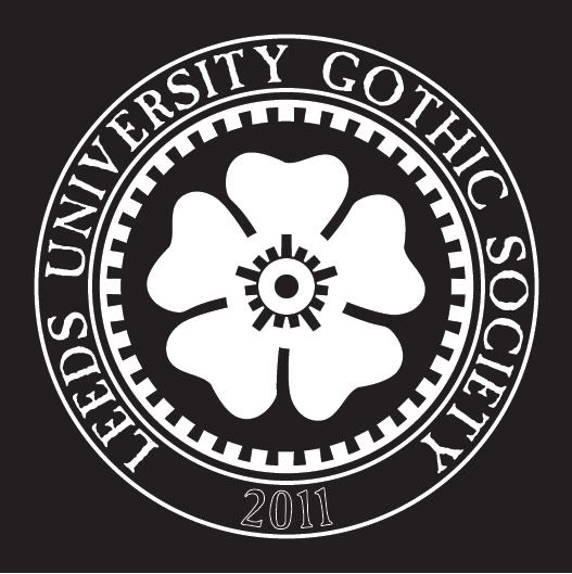
I'd like a nice high version of the People's Republic Of West Yorkshire design, with the cogwheel border.
I'm not very good with circular text, so I'd be grateful for some help changing the text to read:
LEEDS UNIVERSITY GOTHIC SOCIETY
2011
Please don't ask - I'm not even a member I don't think, but one of the girls who runs it is a good friend of mine. I help out with the practical elements like running gigs etc. I'm doing the T Shirt sneakily before the others get a chance to design something rubbish with bats and spiders webs on it.
They were talking about doing an alternative fashion show type thing, and the name "Body Electric: The Alternative Fashion Show" was put forward by said friend and one of the others said said "can we change it to Electric Body so it sounds more cyber?"

Posted: 13 Aug 2010, 15:13
by James Blast
I'll have a rummage in't Blaast! Archiveâ„¢
Posted: 13 Aug 2010, 15:13
by emilystrange
and the answer was...
Posted: 13 Aug 2010, 15:20
by christophe

I so hear you.
Posted: 13 Aug 2010, 15:33
by Maisey
emilystrange wrote:and the answer was...
"P!ss off"
Posted: 13 Aug 2010, 15:33
by Maisey
James Blast wrote:I'll have a rummage in't Blaast! Archiveâ„¢
Thankee

Posted: 13 Aug 2010, 15:38
by James Blast
I've found the artwork, unfortunately I only have a PDF version of it and when I translate it back to vectors in Illustraitor (spit!) it loses all the font information. I've dropped it into The Mighty Freehand! and I'll clean it up tonight.
amn't I just great?
Posted: 13 Aug 2010, 15:40
by Maisey
Designer extraordinaire.
Posted: 13 Aug 2010, 16:24
by James Blast
Posted: 13 Aug 2010, 16:26
by BillyBadBreaks
James Blast wrote:I've found the artwork, unfortunately I only have a PDF version of it and when I translate it back to vectors in Illustraitor (spit!) it loses all the font information. I've dropped it into The Mighty Freehand! and I'll clean it up tonight.
amn't I just great?
nah mate!
Posted: 13 Aug 2010, 16:33
by Quiff Boy
purrty
however, there are a couple of potential problems with that concept:
a) it looks (deliberately) like the sisters 'people's republic" tee
which is not really a problem on it's own, if it wasn't that:
b) phono paul already did one for the leeds goth scene just like that a couple of years ago
sorry guys

Posted: 13 Aug 2010, 16:39
by Maisey
Way ahead of you on both counts

Paul's quite happy having it as a MkII of that design - I don't think he ever printed it, I've certainly never seen one!
He used it for the Black Sheep flyer though.
I have no issue ripping off the Sissies shirt for it, it's a deliberate fun poke at them, and far more in keeping with LeedsGothSoc than spiders and bats etc.
Lastly - the Goth soc are paying for it and I (Blast!) get to design it - and I've wanted one of those shirts for years but never been able to find one. So now I get to make my own
Posted: 13 Aug 2010, 16:39
by James Blast
I was merely responding to a request, I'm going to sit out back an cry into my beer
Posted: 13 Aug 2010, 16:40
by Maisey
Posted: 13 Aug 2010, 17:11
by Quiff Boy
blast - i was just pointing it out to maisey. i know you
ver only obeying orderz
maisey - fair enough

Posted: 13 Aug 2010, 18:49
by James Blast
I was jesting
Boss but I did have a few pangs of "Copyright Infringement", what the hell I'm only the mechanic, Maisey's the driver
Posted: 13 Aug 2010, 19:22
by Maisey
Not "Copyright Infrigment" as "utter shamelessness"
Anyway, it's ok if you're not trying to pass it off as your own work - it's
supposed to be a tribute to the Sisters

It's like the time Dave from Vendemmian wore a T shirt that said "REAL GOTHS ARE OLD"
Porl King emailed him saying something along the lines of: "you stealing cnut. Why do you people keep having to rip off my ideas? I did a shirt with that slogan years ago so you can fcuking stop wearing that rip off".
To which Dave replied:
"It
is a fcuking Rosetta Stone shirt."
Posted: 13 Aug 2010, 20:48
by James Blast
wouldn't we all be happier with something like this?

Posted: 13 Aug 2010, 21:11
by emilystrange
ooo. edgy.
Posted: 13 Aug 2010, 21:15
by James Blast
spikey
Posted: 13 Aug 2010, 21:16
by BaroqueHyena
I'm actually liking the second one a lot. Certainly eye-catching.
Posted: 13 Aug 2010, 21:23
by emilystrange
James Blast wrote:spikey
that's the word i was looking for.
Posted: 13 Aug 2010, 21:27
by Izzy HaveMercy
James Blast wrote:wouldn't we all be happier with something like this?
Looks like the Brown Eye of Sauron now.
Like it a lot.
Has ANGST written all over it
IZ.
Posted: 13 Aug 2010, 21:54
by James Blast
it was meant to look like Sauron's Jap's Eye...
Damn! 
Posted: 13 Aug 2010, 22:31
by Izzy HaveMercy
James Blast wrote:it was meant to look like Sauron's Jap's Eye...
Damn!
That's Illustrator for you. WYSIWYAG.
IZ.