Page 1 of 2
Reptile House ep cover
Posted: 02 Aug 2011, 17:53
by susky
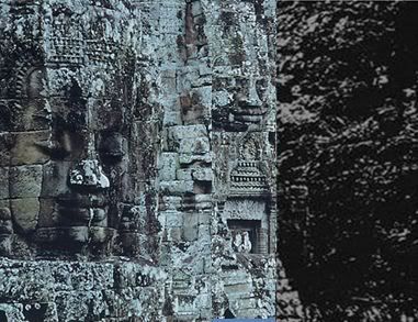
Way way too much time on my hands at the moment.... Digging around looking for the origins of the Reptile House e.p. coverart (thanks to previous post I think I've located the national geographic article the inspiring image came from - Dec 1968 issue, I think). So, looks like there was some doctoring of the original image to get to the resulting Reptile House coverart. Here's how I think we get there:
original image from national geographic:

Isolate these two pieces (in red) and get rid of everything else:
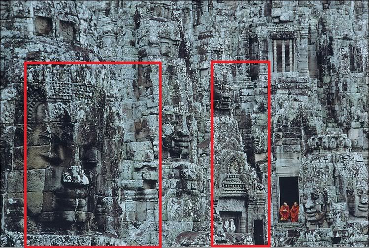
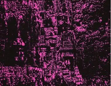
Slap those two pieces (in red) together and add a murky, blurred image off to the right:

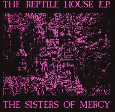
once it's colored violet and the lettering tacked on looks pretty close to this:
Voila! OK....sorry for that indulgence. Back to reality now......

Posted: 02 Aug 2011, 18:09
by SteBacchus
And hey presto
Posted: 02 Aug 2011, 18:55
by iesus
extraordinary
it makes sense now

thank you for contribution

Posted: 02 Aug 2011, 19:50
by Being645
Good job,
susky, eh Scott ...

....
* I've set a link to this thread in
the Wiki, see Remarks...

...
Posted: 02 Aug 2011, 22:22
by Big Si
Aye, many thanks
susky
Posted: 03 Aug 2011, 00:03
by stufarq
The "murky image" is probably a blow-up of a small section of the picture - perhaps the hair of one of the heads?
Posted: 03 Aug 2011, 06:27
by Ozpat

Impressive....
Posted: 03 Aug 2011, 08:35
by Silver_Owl
Good work.

Posted: 03 Aug 2011, 08:45
by Kutan
Excellent work.
But I think only the lower part of the right section has been shifted to the left. The smiling face in the middle of the original photo fits the Reptile House cover better, IMHO.
Posted: 03 Aug 2011, 12:30
by Aazhyd
Can you also tell us when the new album will be released? That would be great.
Posted: 03 Aug 2011, 12:31
by Quiff Boy
Posted: 03 Aug 2011, 14:22
by Bartek
You must be working on CIA, MI5 or 6 or Mossad.
Posted: 03 Aug 2011, 14:29
by Brad
Kutan is right.
Posted: 03 Aug 2011, 14:48
by damagedone
cool
Posted: 03 Aug 2011, 18:35
by susky
Kutan wrote:Excellent work.
But I think only the lower part of the right section has been shifted to the left. The smiling face in the middle of the original photo fits the Reptile House cover better, IMHO.
Good point. Well, it does look like the whole right section was shifted to the left, but yeah the middle bit (just below the face and just above the arch way) looks like it was cropped out so the face could drop into the center of the frame and sit on top of the arch. I'm sure Eldritch and co were using a snazzy pair of scissors and tape when they did this in order soften the edges and round it all out...as opposed to my blunt rectangular crop/cut/paste!
Also, on the Reptile House cover there's a bit more of the image along the bottom inch or so compared to the original pic I linked to above. Maybe the image that ran in the National Geographic mag was bigger than the one one the national geo website. I'm offically on the hunt for the original publication! Off to ebay now!
Posted: 03 Aug 2011, 18:44
by susky
Wow, so check this out....I just made my way over to ebay and located a copy of the Dec 1968 issue of National Geographic. Sure enough, there's the "Mekong, River of Terror and Hope" article listed on the cover which contained the Bayon pics used for the Reptile House e.p. cover. BUT! also across the bottom in the red banner (seemingly unrelated to the Mekong story) is an ad for a TV broadcast titled: "SEE 'REPTILES AND AMPHIBIANS' TUESDAY, DEC 3 on CBS TV'.
Check it out below. Reptiles! The plot thickens....

Posted: 03 Aug 2011, 19:12
by Kutan
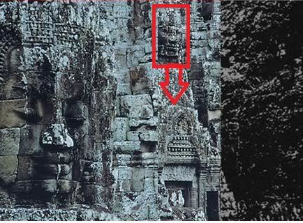
I don't think the face you marked was cut and dropped on top of the arch, I think only the arch was cut and moved to the left. Then it would find its place below the "smiling face" (as I called it).
"Reptiles" indeed
This is too good to be just a coincidence.
Posted: 03 Aug 2011, 20:22
by susky
Kutan wrote:I don't think the face you marked was cut and dropped on top of the arch, I think only the arch was cut and moved to the left. Then it would find its place below the "smiling face" (as I called it).
"Reptiles" indeed
This is too good to be just a coincidence.
OK, yeah Kutan you're absolutely right. I didn't understand what you meant earlier but I see it now. Yes, only the arch was moved over from the portion on the right and now it seems to fall into place.
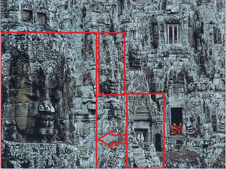
Here's a clunky retry via Microsoft Paint sticking it all back together and adding the murky bit on the right side....obviously lacking the essential dash of scissors/glue/xerox/DIY-magic though!
Posted: 03 Aug 2011, 20:32
by markfiend
I think that's pretty much exact!
Posted: 03 Aug 2011, 20:40
by Kutan
Yeah, Scott, that's what I meant!
Posted: 03 Aug 2011, 23:33
by stufarq
Wonder why they went to all the trouble of cutting and pasting when the final image (ie the record sleeve) is virtually impossible decipher unless you already know what it is. They'd have got pretty much the same effect for less effort.
And why the featureless section on the right rather than more detail from the original image?
Posted: 03 Aug 2011, 23:38
by Kutan
Because Andrew simply did not like the original photo as it was?
Posted: 04 Aug 2011, 00:25
by susky
stufarq wrote:And why the featureless section on the right rather than more detail from the original image?
I think that's the sodium haze over there on the right
Posted: 04 Aug 2011, 23:03
by stufarq
Kutan wrote:Because Andrew simply did not like the original photo as it was?
Yeah, I get that, but you can't
see the photo after he'd finished with it. It's just a pink blur. Seems a lot of effort to create something no-one can make out.
susky wrote:stufarq wrote:And why the featureless section on the right rather than more detail from the original image?
I think that's the sodium haze over there on the right

Posted: 04 Aug 2011, 23:09
by timsinister
Nice!