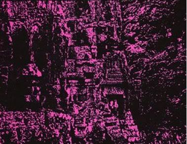
Reptile House ep cover

THE place for your Sisters-related comments, questions and snippets of Sisters information. For those who do not know, The Sisters of Mercy are a rock'n'roll band. And a pop band. And an industrial groove machine. Or so they say. They make records. Lots of records, apparently. But not in your galaxy. They play concerts. Lots of concerts, actually. But you still cannot see them. So what's it all about, Alfie? This is one of the few tightly-moderated forums on Heartland, so please keep on-topic. All off-topic posts will either be moved or deleted. Chairman Bux is the editor and the editor's decision is final. Danke.
User avatar
susky
Road Kill
Posts: 48
Joined: 30 Jul 2011, 23:27
Location: under the falling....under the spell

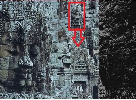
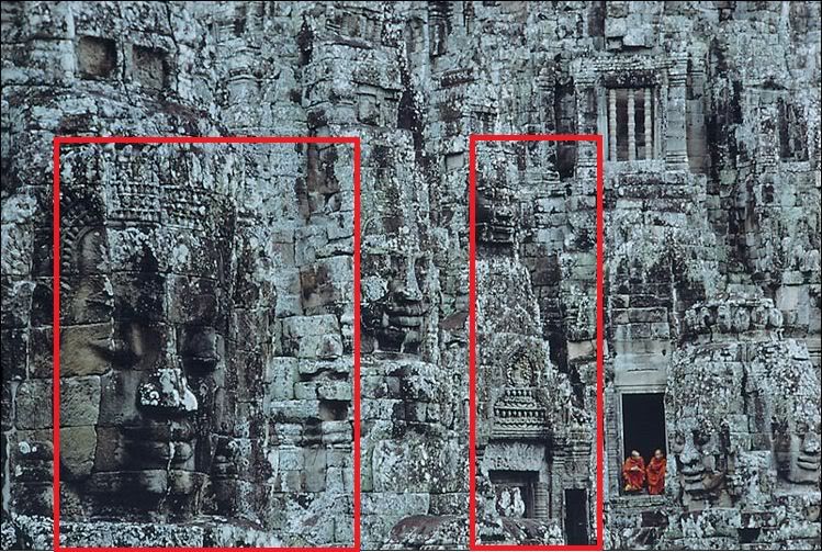
Way way too much time on my hands at the moment.... Digging around looking for the origins of the Reptile House e.p. coverart (thanks to previous post I think I've located the national geographic article the inspiring image came from - Dec 1968 issue, I think). So, looks like there was some doctoring of the original image to get to the resulting Reptile House coverart. Here's how I think we get there:

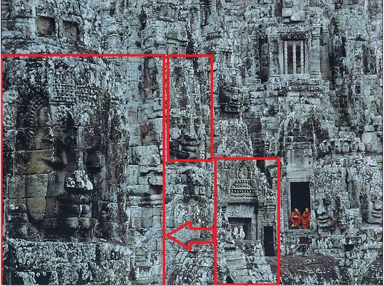
original image from national geographic:

Image

Isolate these two pieces (in red) and get rid of everything else:
Image

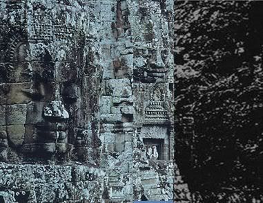
Slap those two pieces (in red) together and add a murky, blurred image off to the right:

Image

once it's colored violet and the lettering tacked on looks pretty close to this:
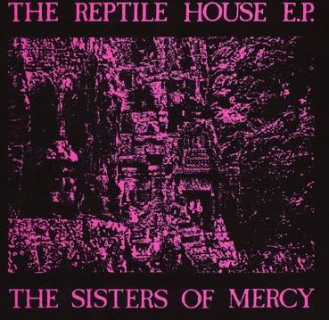
Image

Voila! OK....sorry for that indulgence. Back to reality now...... :D
User avatar
SteBacchus
Amphetamine Filth
Posts: 249
Joined: 29 Aug 2009, 21:55
Location: Bolton

And hey presto
I don't doubt and I don't take direction....
User avatar
iesus
Overbomber
Posts: 4455
Joined: 15 Mar 2006, 11:15
Location: x-EU

extraordinary :D
it makes sense now :!: :!:

thank you for contribution :)
'Are we the Baddies?'...
"Someday! Someday, everything you need, is just gonna fall out of the sky..." -A.E. Reading 1991
"Don't forget that most of the judges in witches trials had harvard degrees."
User avatar
Being645
Wiki Wizard
Posts: 15270
Joined: 09 Apr 2009, 12:54
Location: reconstruction status: whatever the f**k

Good job, susky, eh Scott ... :D :notworthy: ....


* I've set a link to this thread in the Wiki, see Remarks... ;D ...
Last edited by Being645 on 02 Aug 2011, 22:55, edited 2 times in total.
User avatar
Big Si
School Bully
Posts: 6747
Joined: 19 Nov 2002, 00:00
Location: Glesga Central

Aye, many thanks susky :notworthy:
Wyrd bið ful aræd...

mybelgiannemesis
User avatar
stufarq
Popweazle Piddlepoop
Posts: 3209
Joined: 19 Jan 2008, 17:09
Location: my own imagination

The "murky image" is probably a blow-up of a small section of the picture - perhaps the hair of one of the heads?
Any more of that and we'll be round your front door with the quick-setting whitewash and the shaved monkey.
User avatar
Ozpat
From the Lowlands
Posts: 6758
Joined: 16 Aug 2005, 13:14
Location: In the place through which we wander.

:eek:

Impressive....
"as we walk on the floodland"
User avatar
Silver_Owl
The Don
Posts: 7498
Joined: 27 Sep 2003, 18:52

Good work. :wink:
We forgive as we forget
As the day is long.
User avatar
Kutan
Gonzoid Amphetamine Filth
Posts: 327
Joined: 22 Jan 2007, 15:27

Excellent work.

But I think only the lower part of the right section has been shifted to the left. The smiling face in the middle of the original photo fits the Reptile House cover better, IMHO.
User avatar
Aazhyd
Amphetamine Filth
Posts: 229
Joined: 29 Apr 2009, 07:48
Location: The low damp ground
Contact:

Can you also tell us when the new album will be released? That would be great.
Only the Americans could have built a place like this in the middle of a jungle.
User avatar
Quiff Boy
Herr Administrator
Posts: 16794
Joined: 25 Jan 2002, 00:00
Location: Lurking and fixing
Contact:

Ozpat wrote::eek:

Impressive....
agreed. really good work there :eek: 8) :notworthy:
What’s the difference between a buffalo and a bison?
Bartek
Underneath the Rock
Posts: 6141
Joined: 17 Sep 2005, 10:47

You must be working on CIA, MI5 or 6 or Mossad. :eek: :notworthy:
User avatar
Brad
Utterly Bastard Groovy Amphetamine Filth
Posts: 668
Joined: 22 Jan 2003, 18:25
Location: Canada

Kutan is right.
User avatar
damagedone
Utterly Bastard Groovy Amphetamine Filth
Posts: 589
Joined: 04 Jul 2010, 19:25
Location: from around

cool
Keep Music Evil
User avatar
susky
Road Kill
Posts: 48
Joined: 30 Jul 2011, 23:27
Location: under the falling....under the spell

Kutan wrote:Excellent work.

But I think only the lower part of the right section has been shifted to the left. The smiling face in the middle of the original photo fits the Reptile House cover better, IMHO.
Good point. Well, it does look like the whole right section was shifted to the left, but yeah the middle bit (just below the face and just above the arch way) looks like it was cropped out so the face could drop into the center of the frame and sit on top of the arch. I'm sure Eldritch and co were using a snazzy pair of scissors and tape when they did this in order soften the edges and round it all out...as opposed to my blunt rectangular crop/cut/paste!

Image

Also, on the Reptile House cover there's a bit more of the image along the bottom inch or so compared to the original pic I linked to above. Maybe the image that ran in the National Geographic mag was bigger than the one one the national geo website. I'm offically on the hunt for the original publication! Off to ebay now! :)
User avatar
susky
Road Kill
Posts: 48
Joined: 30 Jul 2011, 23:27
Location: under the falling....under the spell

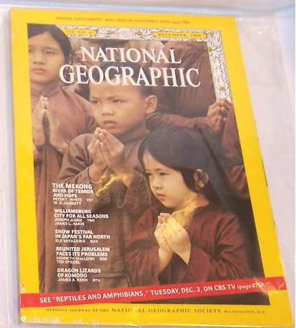
Wow, so check this out....I just made my way over to ebay and located a copy of the Dec 1968 issue of National Geographic. Sure enough, there's the "Mekong, River of Terror and Hope" article listed on the cover which contained the Bayon pics used for the Reptile House e.p. cover. BUT! also across the bottom in the red banner (seemingly unrelated to the Mekong story) is an ad for a TV broadcast titled: "SEE 'REPTILES AND AMPHIBIANS' TUESDAY, DEC 3 on CBS TV'.

Check it out below. Reptiles! The plot thickens....

Image
User avatar
Kutan
Gonzoid Amphetamine Filth
Posts: 327
Joined: 22 Jan 2007, 15:27

I don't think the face you marked was cut and dropped on top of the arch, I think only the arch was cut and moved to the left. Then it would find its place below the "smiling face" (as I called it).

"Reptiles" indeed :)
This is too good to be just a coincidence.
User avatar
susky
Road Kill
Posts: 48
Joined: 30 Jul 2011, 23:27
Location: under the falling....under the spell

Kutan wrote:I don't think the face you marked was cut and dropped on top of the arch, I think only the arch was cut and moved to the left. Then it would find its place below the "smiling face" (as I called it).

"Reptiles" indeed :)
This is too good to be just a coincidence.
OK, yeah Kutan you're absolutely right. I didn't understand what you meant earlier but I see it now. Yes, only the arch was moved over from the portion on the right and now it seems to fall into place.

Image

Here's a clunky retry via Microsoft Paint sticking it all back together and adding the murky bit on the right side....obviously lacking the essential dash of scissors/glue/xerox/DIY-magic though!

Image
Image
User avatar
markfiend
goriller of form 3b
Posts: 21181
Joined: 11 Nov 2003, 10:55
Location: st custards
Contact:

I think that's pretty much exact! :notworthy:
The fundamental cause of the trouble is that in the modern world the stupid are cocksure while the intelligent are full of doubt.
—Bertrand Russell
User avatar
Kutan
Gonzoid Amphetamine Filth
Posts: 327
Joined: 22 Jan 2007, 15:27

Yeah, Scott, that's what I meant! :notworthy:
User avatar
stufarq
Popweazle Piddlepoop
Posts: 3209
Joined: 19 Jan 2008, 17:09
Location: my own imagination

Wonder why they went to all the trouble of cutting and pasting when the final image (ie the record sleeve) is virtually impossible decipher unless you already know what it is. They'd have got pretty much the same effect for less effort.

And why the featureless section on the right rather than more detail from the original image?
Any more of that and we'll be round your front door with the quick-setting whitewash and the shaved monkey.
User avatar
Kutan
Gonzoid Amphetamine Filth
Posts: 327
Joined: 22 Jan 2007, 15:27

Because Andrew simply did not like the original photo as it was?
User avatar
susky
Road Kill
Posts: 48
Joined: 30 Jul 2011, 23:27
Location: under the falling....under the spell

stufarq wrote:And why the featureless section on the right rather than more detail from the original image?
I think that's the sodium haze over there on the right :wink:
User avatar
stufarq
Popweazle Piddlepoop
Posts: 3209
Joined: 19 Jan 2008, 17:09
Location: my own imagination

Kutan wrote:Because Andrew simply did not like the original photo as it was?
Yeah, I get that, but you can't see the photo after he'd finished with it. It's just a pink blur. Seems a lot of effort to create something no-one can make out.
susky wrote:
stufarq wrote:And why the featureless section on the right rather than more detail from the original image?
I think that's the sodium haze over there on the right :wink:
:lol:
User avatar
timsinister
The Oncoming Storm
Posts: 4571
Joined: 04 Jan 2005, 17:08
Location: Newcastle
Contact:

Nice!

:notworthy:
Post Reply