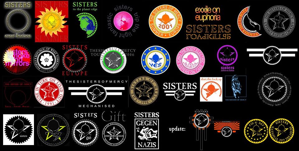
The old head and star has seen a few variants over the years... stars, cogs, half cogs, etc
Also, it started as the logo for the record label, but over time become more of a band logo. (especially as there is no functioning MR record label anymore!)
Has anyone documented how the MR logo has evolved over the years? And when it stopped being a label logo and became a band logo, or even a tour logo?
It's a messy history, I suspect.
eg:
1981 - head and star v1
1982 - head and star v2
1998 - new head and cog
2013 - new head and half star
2016 - new head and half star with cog
or something like that? (I'm not saying those dates are correct btw - they're purely as an example)
Feels like something that could be added to the MR wiki page - https://sisterswiki.org/Merciful_Release
If anyone has the necessary knowledge and imagery to collate the info...?
Merciful Release logos through the years?
- Quiff Boy
- Herr Administrator
- Posts: 16827
- Joined: 25 Jan 2002, 00:00
- Location: Lurking and fixing
- Contact:
There's some stuff here:
https://sisterswiki.org/Band_History
But it doesn't feel like it's quite what I'm after.
https://sisterswiki.org/Band_History
But it doesn't feel like it's quite what I'm after.
What’s the difference between a buffalo and a bison?
- markfiend
- goriller of form 3b
- Posts: 21182
- Joined: 11 Nov 2003, 10:55
- Location: st custards
- Contact:
There was a thread somewhere with a load of t-shirts through the ages, that might help?
Or you could just go through all the records they've released. Oh, wait.
Or you could just go through all the records they've released. Oh, wait.
The fundamental cause of the trouble is that in the modern world the stupid are cocksure while the intelligent are full of doubt.
—Bertrand Russell
—Bertrand Russell
- markfiend
- goriller of form 3b
- Posts: 21182
- Joined: 11 Nov 2003, 10:55
- Location: st custards
- Contact:
That's the thing I was thinking of when I mentioned the t-shirt thread. Nice one.
The fundamental cause of the trouble is that in the modern world the stupid are cocksure while the intelligent are full of doubt.
—Bertrand Russell
—Bertrand Russell
- Quiff Boy
- Herr Administrator
- Posts: 16827
- Joined: 25 Jan 2002, 00:00
- Location: Lurking and fixing
- Contact:
nice! thanks @Scardwel
from those, i guess we could say MR used:
v1) the original gray's anatomy head and star - 1981 - 1982
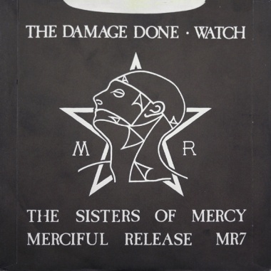
v2) the slightly redrawn version of the original head and star - 1982 - 1994
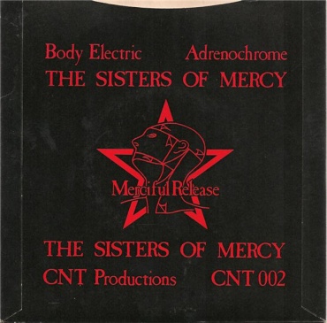
v3) the front-facing head and star (which was sometimes used with a cog around it) - 1994 - present

which is still used on http://www.merciful-release.com/ to this day
and that all other variants belonged to the band, rather than the label?
from those, i guess we could say MR used:
v1) the original gray's anatomy head and star - 1981 - 1982

v2) the slightly redrawn version of the original head and star - 1982 - 1994

v3) the front-facing head and star (which was sometimes used with a cog around it) - 1994 - present

which is still used on http://www.merciful-release.com/ to this day
and that all other variants belonged to the band, rather than the label?
What’s the difference between a buffalo and a bison?
- Quiff Boy
- Herr Administrator
- Posts: 16827
- Joined: 25 Jan 2002, 00:00
- Location: Lurking and fixing
- Contact:
incidentally @Being645 the wiki page here may be wrong on the new logo's start date
https://sisterswiki.org/Band_History
the first usage of the newer front-facing head and star i found was on a La Costa Rasa album released on MR in 1994:
https://sisterswiki.org/Autopilot

although this version does not have the cog, if that makes a difference to what we consider "the logo" to be? (personally i consider the head and star to be the logo, and the cog is just an element around the logo)
https://sisterswiki.org/Band_History
the first usage of the newer front-facing head and star i found was on a La Costa Rasa album released on MR in 1994:
https://sisterswiki.org/Autopilot

although this version does not have the cog, if that makes a difference to what we consider "the logo" to be? (personally i consider the head and star to be the logo, and the cog is just an element around the logo)
What’s the difference between a buffalo and a bison?
- Being645
- Wiki Wizard
- Posts: 15329
- Joined: 09 Apr 2009, 12:54
- Location: reconstruction status: whatever the f**k
@Quiff Boy
Thank you for the hint, I'll see to that.
Btw, the new logo has very often been used without that one arm on the right side, too.
EDIT:
done that , but I see the last part of that page is in want of a review as well ...
https://sisterswiki.org/Band_History
Thank you for the hint, I'll see to that.
Btw, the new logo has very often been used without that one arm on the right side, too.
EDIT:
done that , but I see the last part of that page is in want of a review as well ...
https://sisterswiki.org/Band_History
- ribbons69
- Slight Overbomber
- Posts: 1707
- Joined: 24 Jan 2009, 12:57
- Location: Somewhere, terrified of dying.
I stopped maintaining my "Sisters wardrobe" thread after photobucket wanted paying for their service. The first shirt I remember having a cog was the Event Horizon one from 1998, and that was literally just a cog, no variation of Head and star.
"I've seen Andrew Eldritch in an ice hockey shirt onstage, and I've given him the benefit of the doubt"
Tom G Warrior of Celtic Frost
we fall to rise
Tom G Warrior of Celtic Frost
we fall to rise
- Planet Dave
- Underneath the Rock
- Posts: 6850
- Joined: 22 Apr 2003, 23:51
- Location: Where the streets fold round
Without wishing to in any way shape or form sound like a killjoy, I must say I don't see any evolving going on since the mid 90s change. I see the same logo with different bits missing, often on t-shirts that don't turn up for sale until a few dates into the tour, suggesting he decides which bit to take out this time about 5 minutes before leaving the house. Not always of course, the National Treasure shirt is, well, a national treasure, and for sure sometimes the doktored (  ) logos look superb - Europe 2002 is a fave - but I don't see any evolution really. Still wtf do I know
'This is the water and this is the well...'
- eastmidswhizzkid
- Faster Than The Light Of Speed
- Posts: 9956
- Joined: 24 Mar 2005, 00:01
- Location: WhizzWorld
- Contact:
Am i the only one who thinks the "new" logo is p*ss-poor compared to the old one (82-94)? Because it is . 
"And all my promises are lies
All my love is hate
I am the Politician, and i decide your fate"

All my love is hate
I am the Politician, and i decide your fate"
- Swinnow
- Overbomber
- Posts: 3552
- Joined: 15 Mar 2005, 08:51
- Location: In the Gazebo Of Badness, just outside BD3
True mate, I'm sure it was just coincidence but it happened at the same time that all the football clubs 'modernised' their crests too. They were usually awful too.eastmidswhizzkid wrote: ↑20 Oct 2020, 04:08 Am i the only one who thinks the "new" logo is p*ss-poor compared to the old one (82-94)? Because it is .
....if I have to explain, then you'll never understand....
