
What is the font used for this version of the band name?
Font question
-
RetroGoth

- Amphetamine Filth
- Posts: 174
- Joined: 07 Nov 2005, 04:06
- Location: People's Republic Of West Lancashire
Thanks for that, I thought it was arial but it never looked right when I tried to make covers in the past. I'll have another go one of these days.
On the other hand, the brain of an idiot seldom weighs more than 23oz - Gray's Anatomy
-
Quiff Boy

- Herr Administrator
- Posts: 16827
- Joined: 25 Jan 2002, 00:00
- Location: Lurking and fixing
- Contact:
i seem to recall it might actually be "arial narrow" with some of the letter-spacing removed.
been a while since i copied it from the official website's logo
been a while since i copied it from the official website's logo
What’s the difference between a buffalo and a bison?
-
markfiend

- goriller of form 3b
- Posts: 21182
- Joined: 11 Nov 2003, 10:55
- Location: st custards
- Contact:
Arial at 80% width is identical to the official site's logo. Having said that, Arial narrow is probably Arial at 80% width...
You have to fiddle with the tracking to get the letters almost overlapping like that. A bit of trial and error. IIRC set the tracking at -50 on Photoshop.
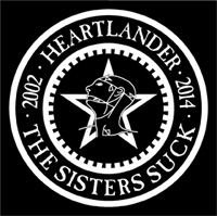
This is the result I got trying to duplicate the logo from the official Sisters site:

You have to fiddle with the tracking to get the letters almost overlapping like that. A bit of trial and error. IIRC set the tracking at -50 on Photoshop.
This is the result I got trying to duplicate the logo from the official Sisters site:
The fundamental cause of the trouble is that in the modern world the stupid are cocksure while the intelligent are full of doubt.
—Bertrand Russell
—Bertrand Russell
-
James Blast
- Banned
- Posts: 24699
- Joined: 11 Jun 2003, 18:58
- Location: back from some place else
I found Arial (spit!) Narrow to be closer than condensing plain Arial (vomit!), but I'm a pain in the ass where typefaces are concerned.
"And when you start to think about death, you start to think about what's after it. And then you start hoping there is a God. For me, it's a frightening thought to go nowhere".
~ Peter Steele
~ Peter Steele
-
Obviousman

- Outside the Simian Flock
- Posts: 7090
- Joined: 22 Aug 2004, 12:14
- Location: Soon over Babaluma
- Contact:
Now we're talking fonts:
What's the font used on Gift, it's not the 'usual' Caslon Antique, is it?
What's the font used on Gift, it's not the 'usual' Caslon Antique, is it?
-
Quiff Boy
- Herr Administrator
- Posts: 16827
- Joined: 25 Jan 2002, 00:00
- Location: Lurking and fixing
- Contact:
dunno what "the sisterhood" is written in but it looks like a fairly standard serif font.Obviousman wrote:Now we're talking fonts:
What's the font used on Gift, it's not the 'usual' Caslon Antique, is it?
and i'm pretty sure the "Gift" bit is "Goudy T Light"
http://www.myfonts.com/fonts/urw/goudy/t-light/
i think its got a bit of weathering added, with a lighting effect on from the left-hand side that casts the right-hand side into shadow. then ramp up the contrast and thats about it. i think. havent tried it but if you have the font its easy enough to try in photoshop.
What’s the difference between a buffalo and a bison?
-
Quiff Boy
- Herr Administrator
- Posts: 16827
- Joined: 25 Jan 2002, 00:00
- Location: Lurking and fixing
- Contact:
after pissing about for a few minutes:

didnt have the "light" version of goudy so tried it with the standard version. couldnt find a decent filter that weathered it so applied a few lighting ones and ramped up the contrast...
nearly. its deifnitely the right font though (the light version that is, not the one i have)
didnt have the "light" version of goudy so tried it with the standard version. couldnt find a decent filter that weathered it so applied a few lighting ones and ramped up the contrast...
nearly. its deifnitely the right font though (the light version that is, not the one i have)
What’s the difference between a buffalo and a bison?
-
James Blast
- Banned
- Posts: 24699
- Joined: 11 Jun 2003, 18:58
- Location: back from some place else
Gift seems to have a classic old face serif (almost impossible to track down, though Goudy is very close) for the band name and a hand drawn font for 'Gift'.
"And when you start to think about death, you start to think about what's after it. And then you start hoping there is a God. For me, it's a frightening thought to go nowhere".
~ Peter Steele
~ Peter Steele
-
Quiff Boy
- Herr Administrator
- Posts: 16827
- Joined: 25 Jan 2002, 00:00
- Location: Lurking and fixing
- Contact:
look at the way the shadowing has picked out the shape if the i's dot, and the feet of the i and f. also the brodge of the t.
i'm pretty sure "Gift" is that same font i've mentioned there.
i'm pretty sure "Gift" is that same font i've mentioned there.
What’s the difference between a buffalo and a bison?
-
James Blast
- Banned
- Posts: 24699
- Joined: 11 Jun 2003, 18:58
- Location: back from some place else
my e-mail went down right after I posted my last comment 
Goudy it is <peeved>
I dug the album out of the Blast Archive tonight, the word 'Gift' is far thinner and has a more hand drawn look, Barry.
Goudy it is <peeved>
I dug the album out of the Blast Archive tonight, the word 'Gift' is far thinner and has a more hand drawn look, Barry.
"And when you start to think about death, you start to think about what's after it. And then you start hoping there is a God. For me, it's a frightening thought to go nowhere".
~ Peter Steele
~ Peter Steele
-
markfiend
- goriller of form 3b
- Posts: 21182
- Joined: 11 Nov 2003, 10:55
- Location: st custards
- Contact:
Fair play to you if you can see a difference!James Blast wrote:I found Arial (spit!) Narrow to be closer than condensing plain Arial (vomit!), but I'm a pain in the ass where typefaces are concerned.
We had a Typography module on our VisCom degree; thank fück I'm not likely ever to have to hand-draw lettering again.
*Edit: Oh, and agreed on the spit and the vomit. Arial is almost as bad as Comic Sans.
The fundamental cause of the trouble is that in the modern world the stupid are cocksure while the intelligent are full of doubt.
—Bertrand Russell
—Bertrand Russell
-
Obviousman
- Outside the Simian Flock
- Posts: 7090
- Joined: 22 Aug 2004, 12:14
- Location: Soon over Babaluma
- Contact:
How about Times New Roman then? I like Arial far better than that, personally... But then again I'm not into all those graphical thingiesmarkfiend wrote:*Edit: Oh, and agreed on the spit and the vomit. Arial is almost as bad as Comic Sans.
Oh, and
-
markfiend
- goriller of form 3b
- Posts: 21182
- Joined: 11 Nov 2003, 10:55
- Location: st custards
- Contact:
Gill Sans for a sans-serif font and Sabon for old-style serifs. I'm not so much into serif fonts unless they're old style. (Which TNR isn't)
The fundamental cause of the trouble is that in the modern world the stupid are cocksure while the intelligent are full of doubt.
—Bertrand Russell
—Bertrand Russell
-
James Blast
- Banned
- Posts: 24699
- Joined: 11 Jun 2003, 18:58
- Location: back from some place else
Garamond Narrow, for obvious reasons 
"And when you start to think about death, you start to think about what's after it. And then you start hoping there is a God. For me, it's a frightening thought to go nowhere".
~ Peter Steele
~ Peter Steele